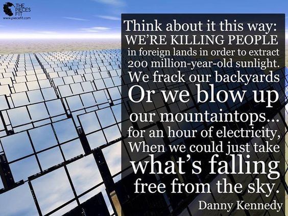
 Electricity and heat production accounts for about 25 percent of global greenhouse gas emissions and is the largest emission sector (source: UN climate panel).
The Map below gives you a snapshot, an almost realtime visual view of, how different countries energy production is composed, how CO2-intensive the production is and how the electricity flows across national borders (go to the source Electricity Map if the map does not show proporly). The greener the color a country has, the less emissions from energy production. Click a country to see details of the country’s capacity eg. water, wind, sun, coal, nuclear power and how much of the capasity is in use now.
For example, one can easily see how variable production from wind and solar power plants affects the energy-mix and CO2 intensity at all times. The first version of the map only had data from Europe, but since then, the United States, New Zealand and parts of Canada and Australia have been added.
Electricity Map was developed by Tomorrow. The project is based on open source, and the map is a “work in progress”. If you are particularly interested you should take a look at the technical explanations. Electricity Map is also awailable as an App “work in progress”. Particularly interested should take a look at the technical explanations. Electricity Map is also available as App on Apple’s AppStore and Google Play.
The developers have made some choices that affect the emission data shown in the map. CO2 intensity from different types of plants / power plants is based on calculated emissions throughout the life cycle of the plant (construction phase, production of fuel, power generation itself, dismantling). For most countries, the average is derived from the UN climate panel. There is little use of data for each power plant. Thus, the map does not divide, for example. between new and old coal power plants, which will have different CO2 intensities. For Norwegian hydropower data from studies made by Østfoldforskning has been used.
For the European countries, most of the real-time data from Entso-E, the organization of the national companies with system responsibility in the power grid, is retrieved. Statnett is a Norwegian member.
EU: Power production becomes less CO2-intensive
The map gives a snapshot of power generation, cross-border exchange and CO2 intensity. But of course it is the overall development over time as a counter. The figure below shows the evolution of CO2 intensity in in power generation in the EU since 1990.


33 Comments
Pingback: generic hydroxychloroquine
Pingback: strength of hydroxychloroquine tablets
Pingback: hydroxychloroquine use in florida
Pingback: hydroxychloroquine fda approval
Pingback: cvs pharmacy coupons for ivermectil
Pingback: how much priligy for 200 pound person
Pingback: gimalxina plaquenil 200mg
Pingback: stromectol every 8 hours
Pingback: medicine with stromectol
Pingback: stromectol tablet 6 mg
Pingback: ivermectin liquid
Pingback: ivermectin pinworms treatment humans
Pingback: stromectol for parasitic infection
Pingback: The World's Sustainable Gazette - Bergensia.com - Bergensia
Pingback: The World's Sustainable Gazette - Bergensia
Pingback: does ivermectin get you high
Pingback: ivermectin otc
Pingback: ivermectin uses
Pingback: ivermectin corona
Pingback: is ivermectin safe
Pingback: ivermectina para que sirve
Pingback: sildenafil 100mg capsule
Pingback: how much is viagra
Pingback: best online pharmacies usa
Pingback: tadalafil 80mg online pharmacy no prescription
Pingback: plaquenil for sale online
Pingback: soolantra for sale canada
Pingback: generic tadalafil daily
Pingback: viagra over the counter australia
Pingback: Ola and Kari Nordmann are learning the brutal truth of a Free Market Economy - Bergensia
Pingback: Bergensia just passed a 1000 articles - Bergensia
Pingback: The World's Sustainable Gazette Bergensia features 1100 articles with 300.000 readers worldwide - Bergensia
Pingback: relax music